


Role: Lead Product Designer
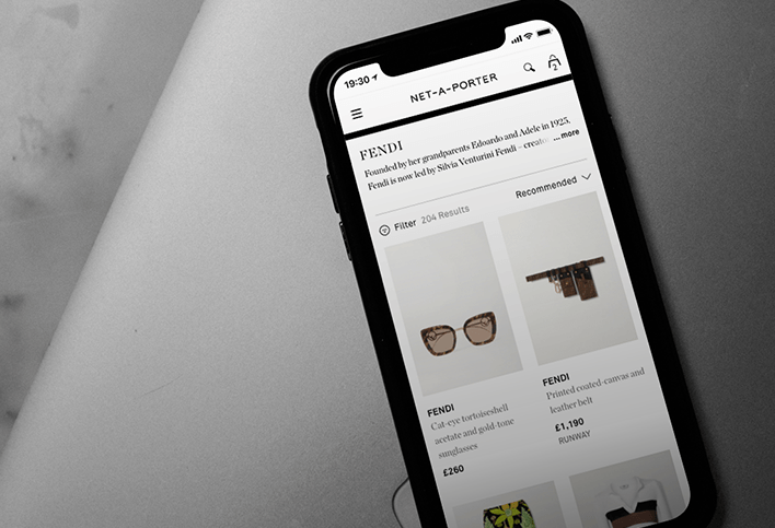
Links: Net-A-Porter
Mr Porter
YOOX Net-A-Porter needed to redesign entirely the user experience and visual direction for their main brands; Net-A-Porter, Mr Porter, The Outnet, and YOOX.
The main goal was to create a unified luxury product experience that delighted customers with a fast, responsive, seamless, listing, details, and wish list journey to aid conversion whilst preserving both the brands’ aesthetics and tone of voice. One scalable UX approach that could fit different brands' propositions.
USER EXPERIENCE
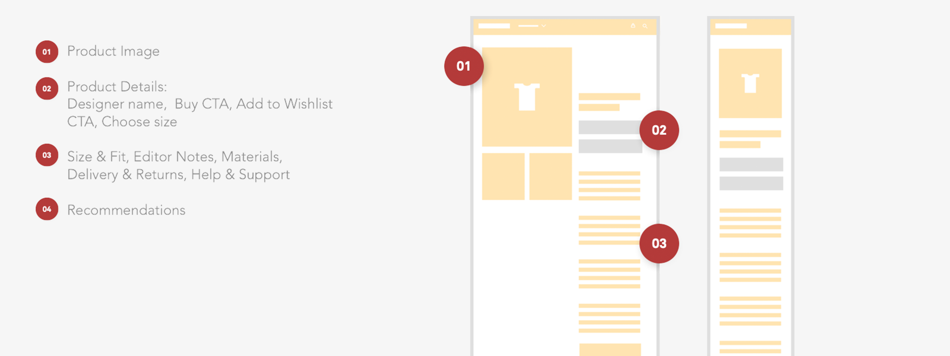
Product Listing Pages, Product Details Pages, and Wishlist cover an extensive part of the User Experience. The redesign process started with a series of workshops, ran involving different departments of the business. The main objective was to identify problems and areas of improvement, to provide the best in class experience to our customers.
We started by mapping out the architecture of Listing and Details Page, to highlight components we wanted to analyse. Key principles we referred to during the workshops were: meeting users' needs, discoverability, usability, consistency, accessibility, and UX hierarchy.
UX ARCHITECTURE
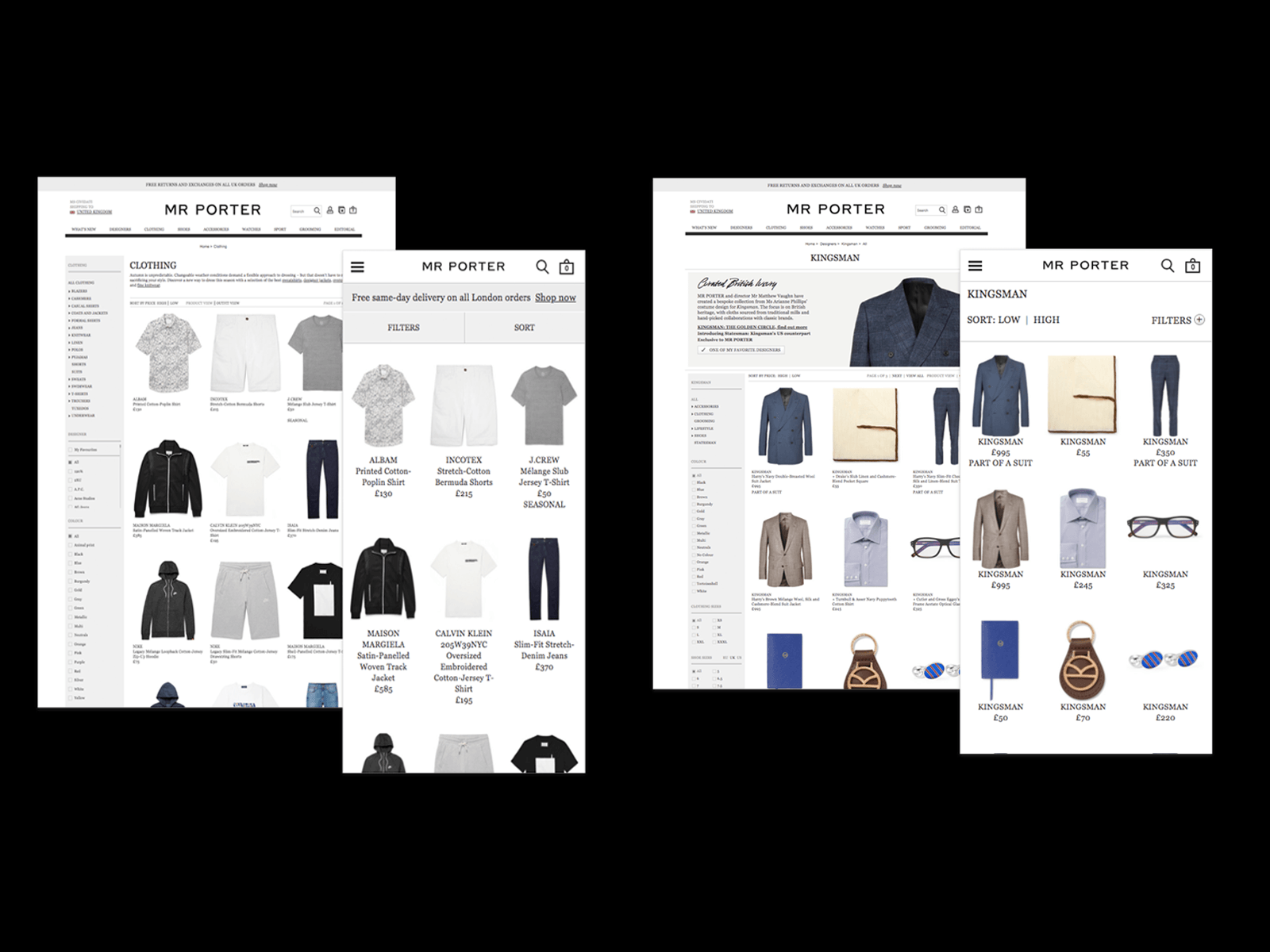
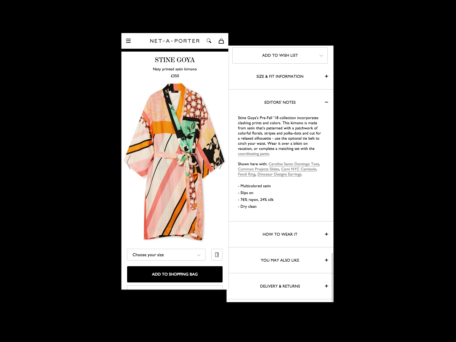
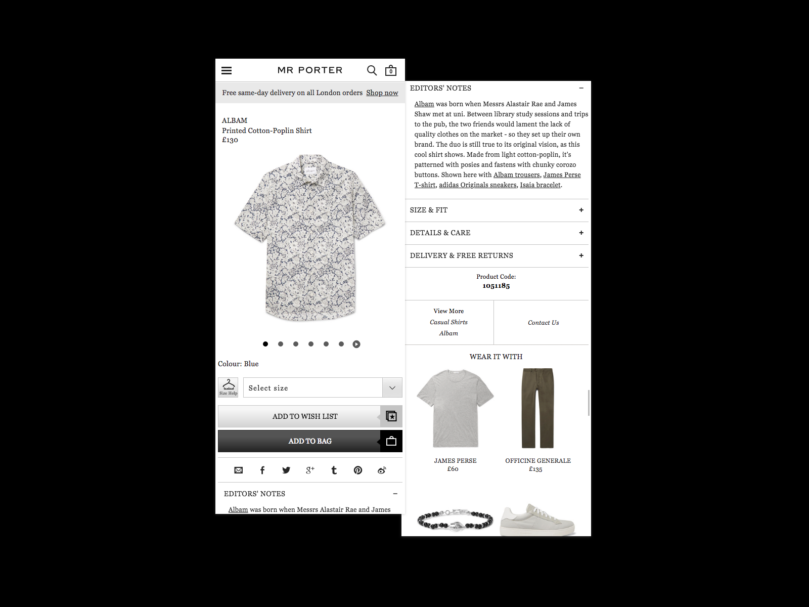
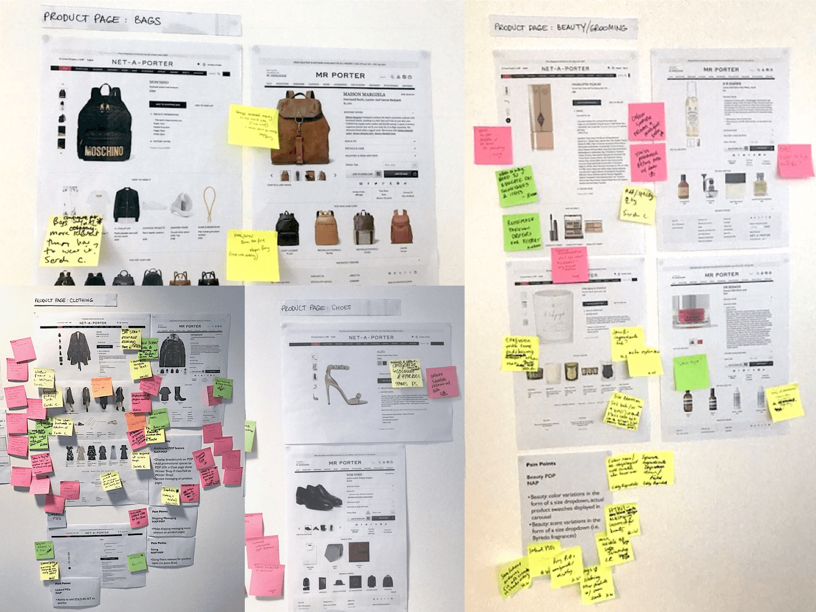
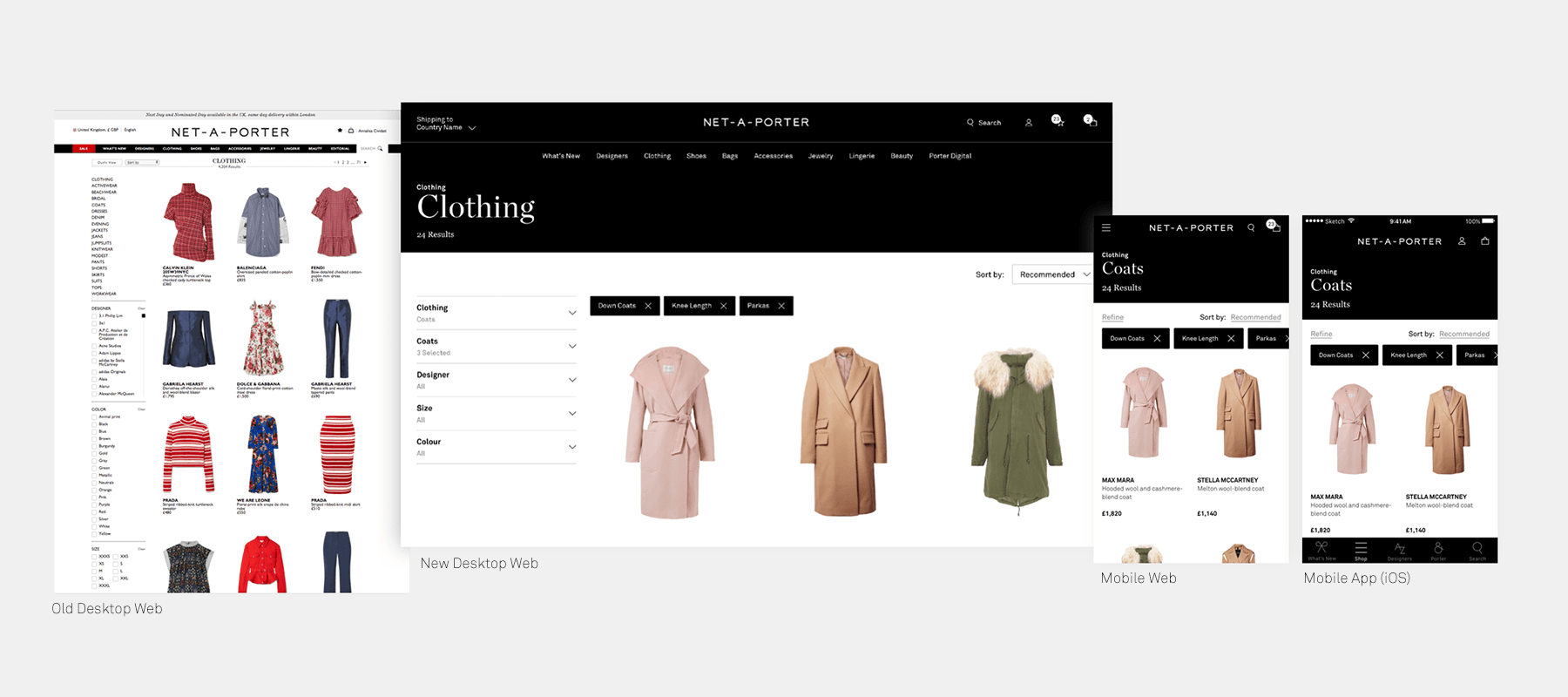
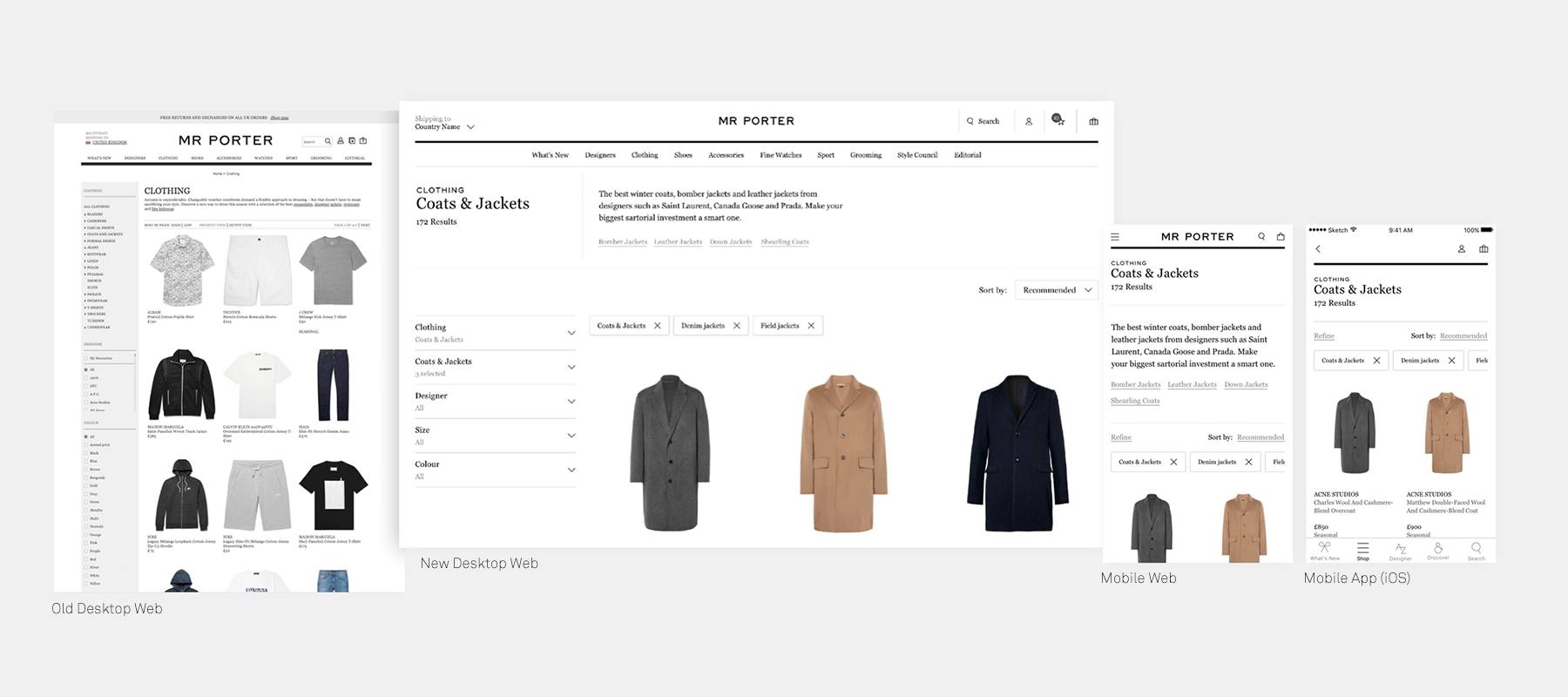
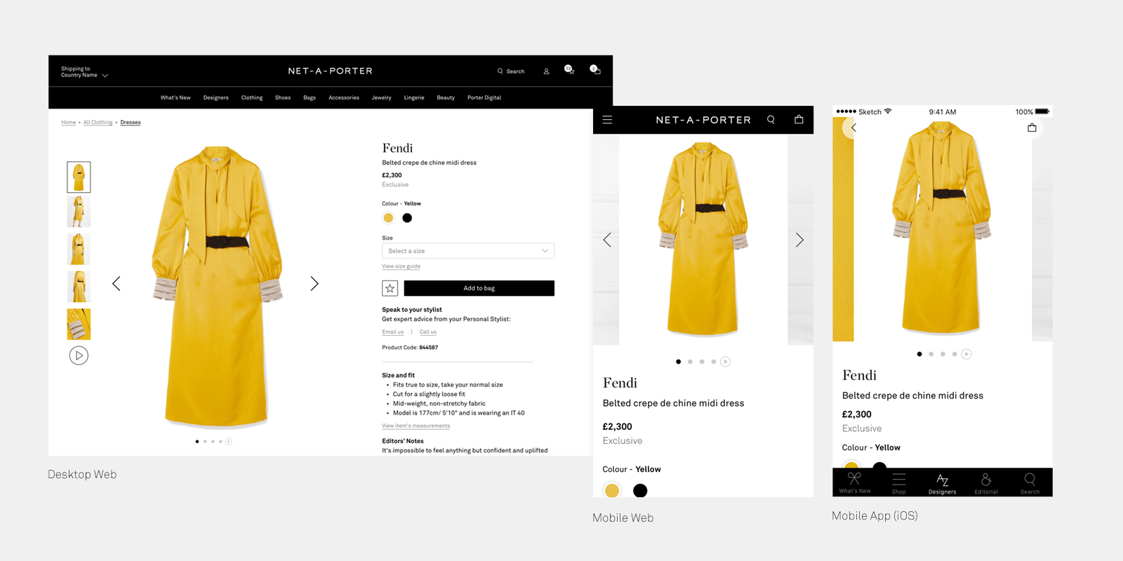
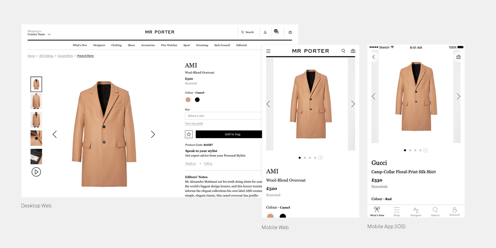
From a deep analysis of the page architecture ran across all permutations of Listing and Details pages, it was quite clear there were UX and visual inconsistencies for pages that ultimately shared the same functionalities. Below you can see an example of different listing pages across Net-A-Porter and Mr Porter.

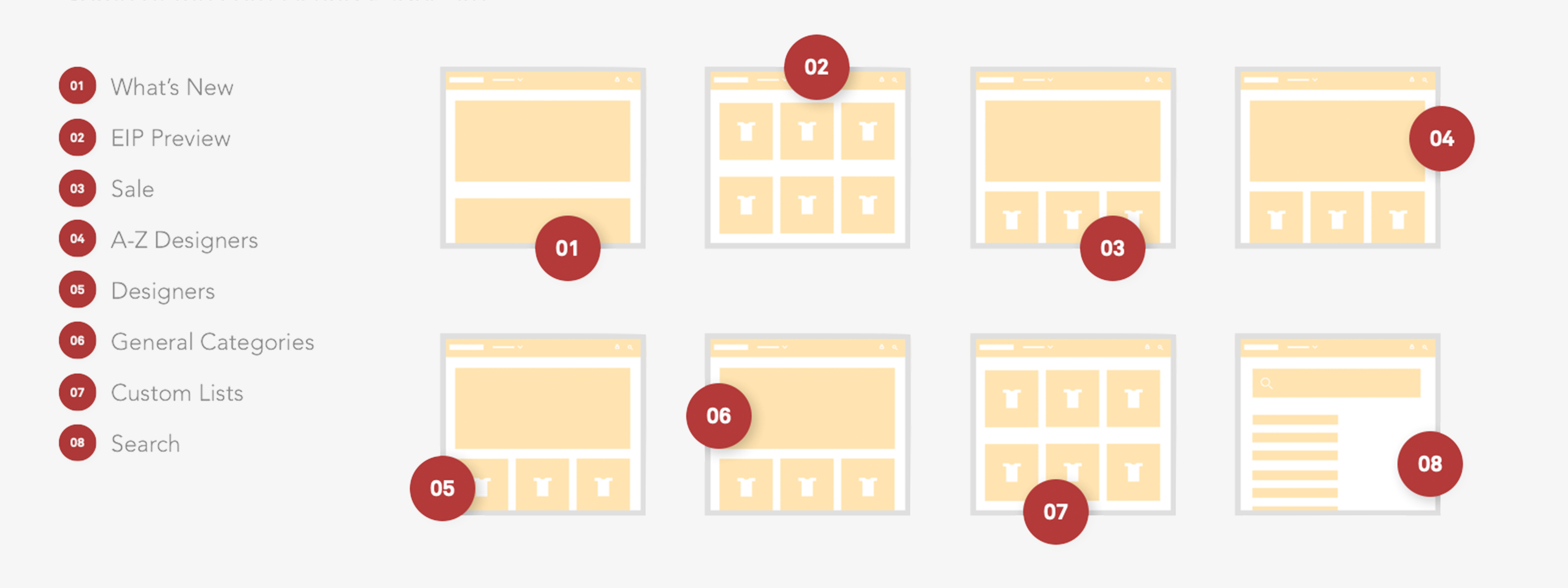

ANALYSIS
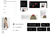
Below you have a few examples of Listing Pages ( Category & Designers ). It's quite clear how the same page has different types of Headings, Filters, Product ID visualisation.


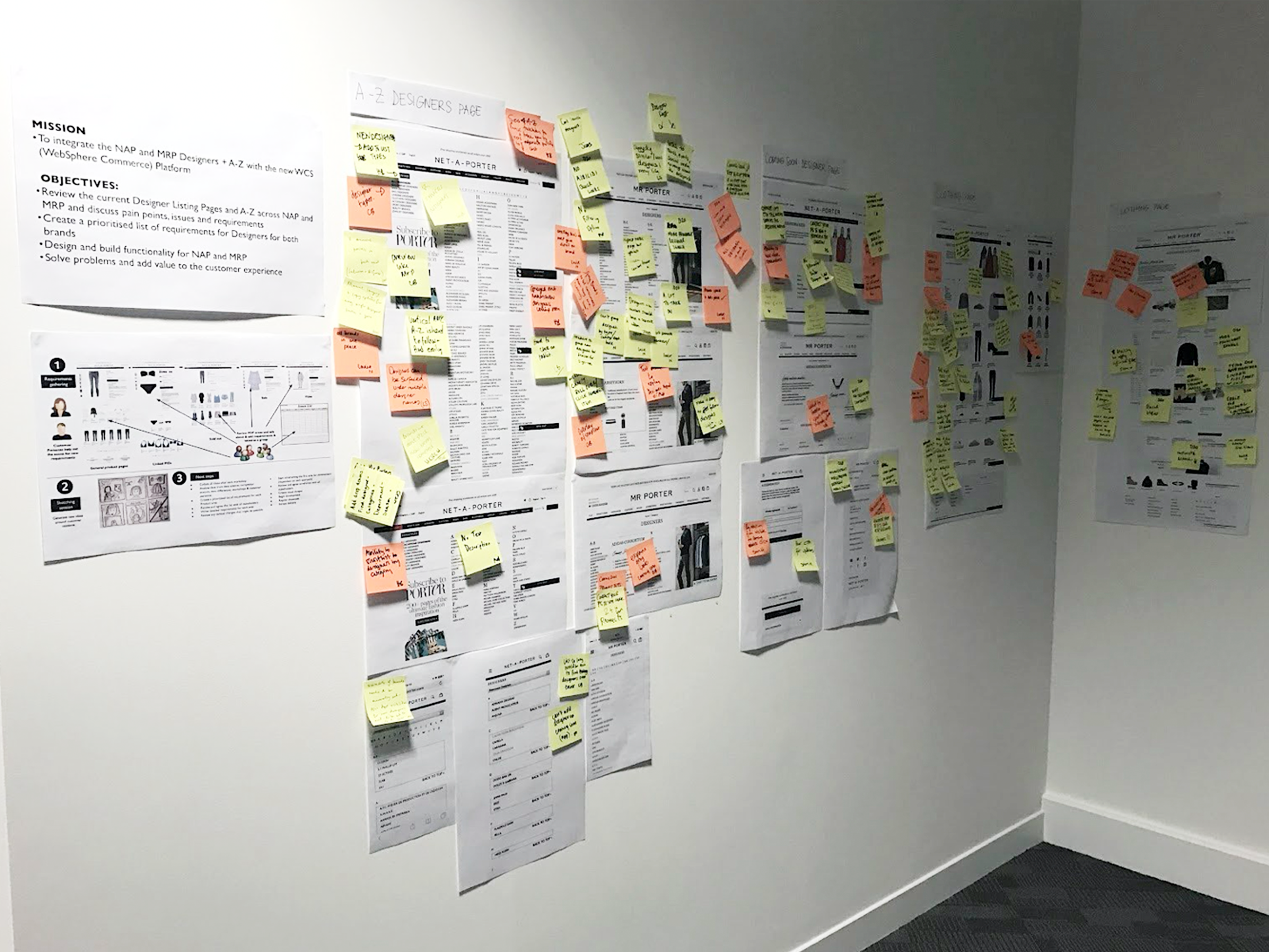

REQUIREMENTS
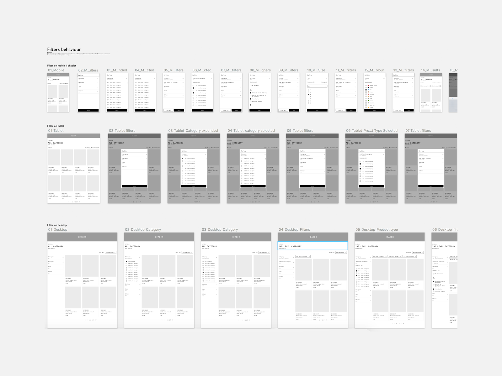
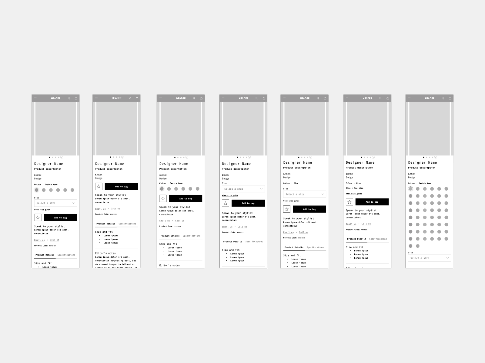
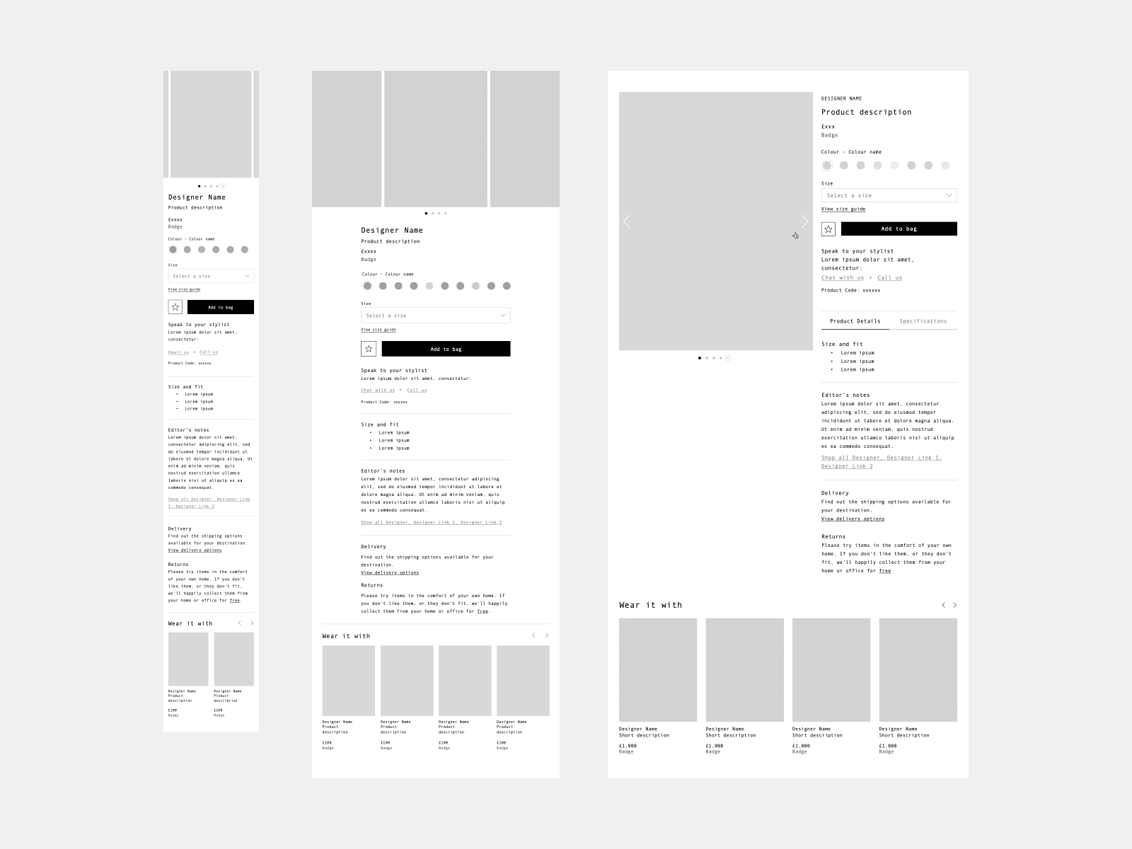
As an outcome of the workshops, we got an exhaustive list of requirements across Listing and Details Pages that allowed the design team to go ahead and explore through discovery how the new experience could work and look like.
Working iteratively with the development team and stakeholders, we produced different prototypes of Listing and Details pages that we put through testing.


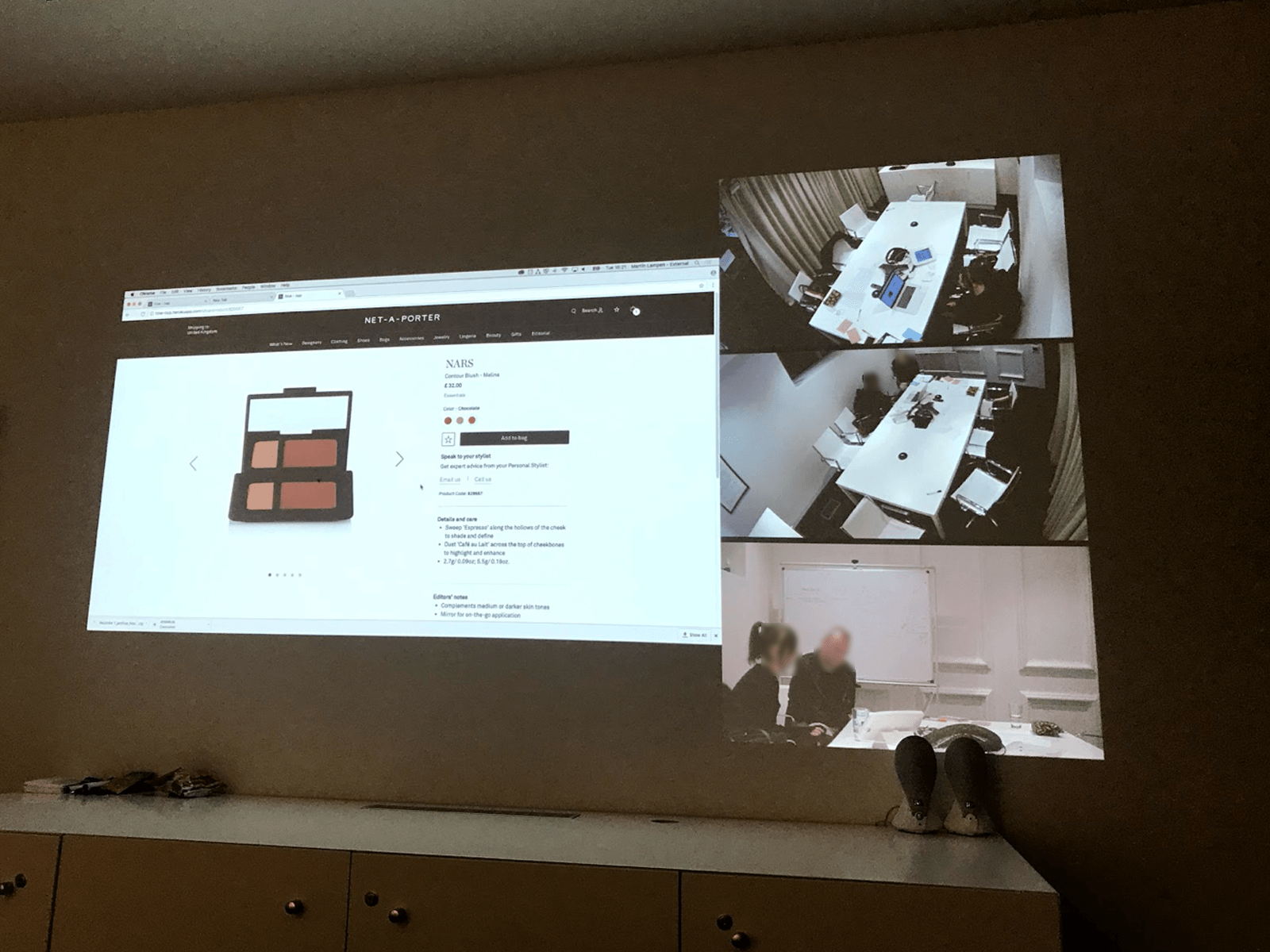
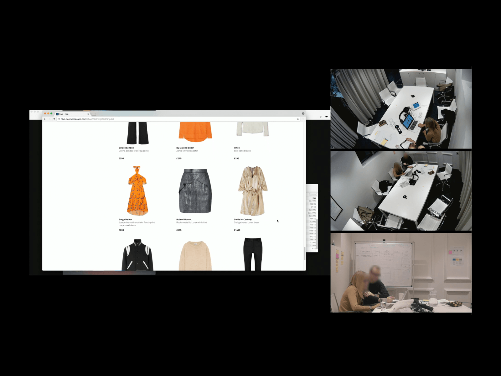
USER TESTING
Once we validated the UX with Tech and Stakeholders, we built several prototypes to test with our customers. After each session, we asked our customers to give us specific feedback on their testing experience against our Design Principles. This was an interesting piece of feedback for us to make sure we were aligned with the type of experience we wanted to deliver our users. Qualitative user testings were followed by a detailed A/B testing plan.
When compared to the previous experience, users mentioned the newly proposed one was more intuitive to use, clean, simple, pleasant and luxurious.


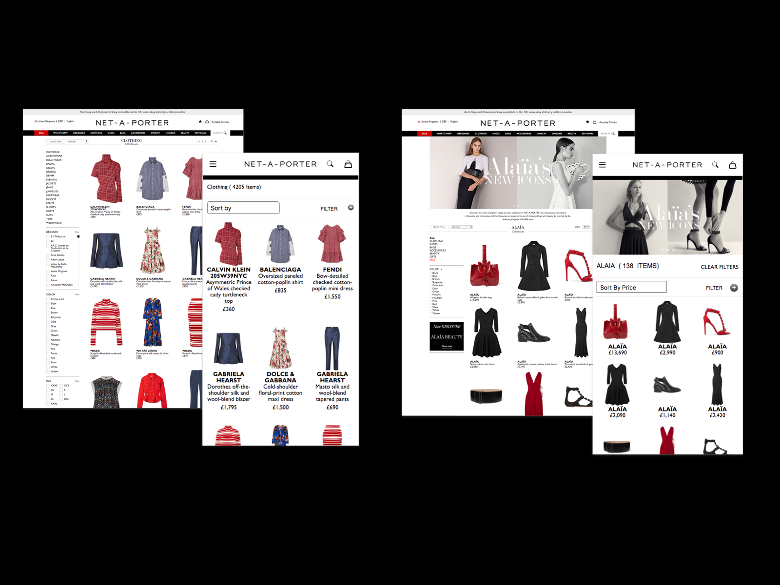
BEFORE & AFTER
Based on user feedback, the new experience has improved customer satisfaction, providing a more seamless and enjoyable shopping experience. Clean and simple interactions helped driving higher conversion rates.


Look at the full design 👉 Net-A-Porter | Mr Porter
Made with 🖤 in a shopping centre